Sunday, 22 February 2015

Basics Photography : Light & Burgin: Thinking Photography (Annotation)

This week key reading(Basics Photography : Light & Thinking Photography, Photography, Phantasy, Function ) touches a range of important issues related to photography, precisely point of view, lighting and ,certainly, how images can create narrative and representation.

'In photography there are old points-of-view, the point of view of a person who stands on the earth and looks straight ahead ,or, as I call it, the 'navel photo', with the camera resting on the stomach. I am fighting against this point-of-view and will carry on fighting for photography from all positions other than the 'navel position', so long as they remain unrecognized. The most interesting angles at present are those from 'top to bottom' and 'from bottom to top' and there is much work to be done in this field.' (Rodchenko, 1928, cited in Burgin, 1982, p. 177) This quotation directs me on thought to produce some images for project with low-angle perspective to show predominance of nature.

'Society is ordered on the basis of what it holds to be true; truth does not stand outside discourse, waiting to be 'expressed' by it; truth is produced by material forms of discourse inscribed in concrete practices.’ (Burgin, 1982, p.214). So the point is that representational practices, including photography, form an integrated specular regime. It influences on how people behave. Therefore, the aim of photographer to make people think about concerns and things that they have a little thought before. In other words,image has to tell a story if it works as art. 

Lastly,  as it was mentioned in first posts photography means play with light. The reading (Basics Photography : Light) was focused on work with flash. 'The most natural light, free of harsh shadows and unpleasant hotspots or highlights, is flash that is both bounced and diffused' (p.96). However, i think i should be extremely careful with exposure as it works correctly just for certain distance. Anyway, i am going to experiment a lot with with flash lighting to find suitable balance.


Reference:

Burgin, V. (1982). Thinking photography. London: Macmillan.
Prakel, D. (2007). Lighting. Lausanne: AVA Academia.

Shop task

For this task with my group mate i was supposed to produce photographs inside shop and choose 5 of them that i consider successful. The first thing, which i would like to mention, is that this exercise was quite complicated to do as it was necessary to communicate with strangers and ask their permission to make images. More than that, i need try to make these people relax and just enjoy the moment in order to reach wanted result. In the end of the shooting, i was so proud of myself that i could overcome all fears and find a contact with the models. This task helped me to develop my camera skills and confidence in interaction with others.

The most amazing thing about these pictures is that a woman smiles and looks directly in the camera. So eye connection with photographer is found and it makes spectator feel joy and calmness of the model. Then, i edited lighting a little (add some warm colors) in both digital captures to emphasize cosiness and uniqueness of the cafe.


As for these images, they were made in Bramber House. If take 3 of them together, they create narrative of a place and representation of relationship between people. On the first one, different kinds of containers with food were shown (like establishing shot). On second one, interaction of customers can be seen (both of them want to help consumer). And on the last one, there is a girl who has just performed her job successfully. She smiles and looks really natural. There is a feeling that she enjoys her life and is ready to treat positively and politely all customers.Indeed, i need to use such strategy in my project. To put it differently, there should be connection between all photos so as to viewers can get desired meaning. Also, 2 last photos have clear focus of interest (customers) and blurred environment. That was applied in Photoshop to underline what is really important in the image and what is not.


Saturday, 21 February 2015

Stanmer Park + contact sheet

To start with, several weeks ago with group i went to take images of landscapes in Stanmer Park. The task was seemed to be quite important for me as the theme of the project i am going to do is related to environmental issues. Few images that can be used for realization of my future ideas and demonstration of my improved camera skills were selected.

The pictures below show the beauty, strength and freedom of nature. Although it is not strongly visible but in the composition some buildings (sport complex on first one and church on the second one) were framed. The meaning is that even in a quite rural areas full of pictorial panoramas there are constructions that destroyed environment, thereby impair ecological conditions.


As for this digital capture, i really enjoy composition that locate clock proportionally in the middle. As well, i found light colors are really nice.


The reason why i chose these 2 photos is that such green colors of grass seem really saturated. That attracts  attention of audiece and make them explore image in details. Moreover, on first picture meandering branches draw a road for spectators and influence on their imagination. As for second one, i like blurred background and clear focus of interest. 


Contact sheet of all images


Monday, 9 February 2015

Photographs of random people + Contact sheet

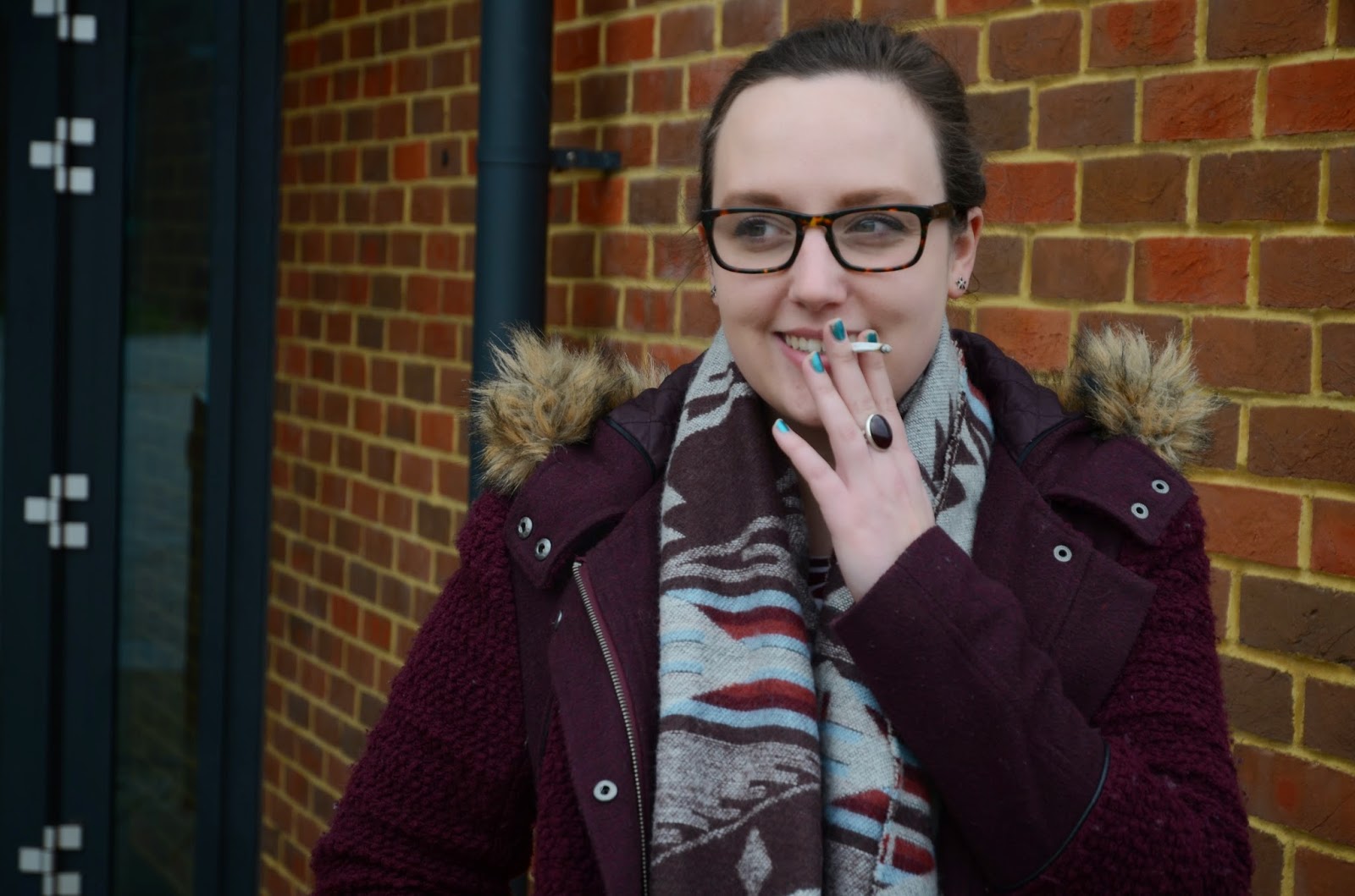
Today i was required to produce series of images of random people's close ups and medium shots. Hence i made a decision to walk around on campus to search for models. These are some photographs, which i can call successful for several reasons.

 What i like about given shot is that the girl is in the process. Because she is smoking and smiling it creates natural atmosphere and makes viewers believe that she is not acting for camera. However, she is alone and not looking directly. So there is a sense, which suggests her discomfort and unwillingness to work with photographer. What i need to practice more is how to communicate with models closely to make them relax.


 As regards this photo, i enjoy chosen composition. The rules of thirds is fulfilled here. However, despite the fact she chatted with man, i didn't include him in frame therefore again there is just one person who preferred not to look directly in camera. This is not right decision as spectators can avoid reading the narrative, as they can feel model's constraint.

This image below is distinguished by movements and energy. Although girls avoid eye contact as well, photograph works quite well here because they are relaxed and happy. They are interacting with each other and enjoy this short moment of their life. The one things that can be improved is ratio between depth of field and shutter speed as sitters are a little blurred and there is selective focus on background. 


Contact sheet of all images:


Sunday, 8 February 2015

Hall: The Spectacle of the Other (Chapter 4) (Annotation)

'The spectacle of the 'other''(chapter 4) written by Hall touches such important themes as representation, difference, stereotypes and power. Several ideas from this reading seem to be very helpful in development of comprehension of how images, including photography, works.

It is crucial to be aware that 'The same photo can carry several, quite different, sometimes diametrically opposite meanings. Two discourses (the discourse of written language and the discourse of photography) are required to produce ‘fix meaning’ (p.228). Because of this it will be quite significant to research the topic completely, taking into account all nuances, and think carefully about names of the set of digital captures that i am going to make for the final project in order to viewers can realize what is depicted correctly.

Next, meaning depends on the difference between opposites (without this diversity meaning does not exist). Paradoxically, but this 'difference' is 'powerful, strangely attractive and precise' (p. 245). Therefore, by playing on contrasts message can be delivered more accurate and it is essential to remember.


Reference:

Hall, S. (1997). Representation. London: Sage in association with the Open University.

Berger: Ways of seeing (Chapter 1) (Annotation)

 For week 2 core reading, including 'Ways of seeing' by Berger (1972), was done.The first thing that i was interested in is 'The relation between what we see and what we know is never settled' (p.7). Therefore  'The way we see things is affected by what we know or what we believe' (p. 8). In other words, understanding of each image depends on cultural background and associations of viewers. Because of this, each time photographer makes photographs target audience should be selected.

Then, 'An image is a sign which has been recreated or reproduced. It is an appearance, or set of appearances, which has been detached from the place and time in which it first made its appearance and preserved - for a few moments or a few centuries. Every image embodies a way of seeing. Even a photograph. Every time we look at a photograph, we are aware, however slightly, of the photographer selecting that sight from an infinity of other possible sights. The photographer's way of seeing is reflected in his choice of subjects' (p. 9-10). Hence, as a photographer i need realize that i am the key person who selects objects (focus of interest) and builds composition in a way, where spectators can see the meaning that i intend to communicate.


Reference:

Berger, J. (1973). Ways of seeing. London: British Broadcasting Corp.

Saturday, 7 February 2015

Presentation 1: Vernacular photography


The first thing, which should be mentioned about vernacular photography, is that this genre is concentrated on everyday life of ordinary people. Not in vain August Sander, one of famous representative of given style, said 'photography is the nature of documentary'. In fact, documentary and vernacular photography have similar characteristics. Both of them intend to show life materially, in a way as it really is. Indeed, i am quite interested in the techniques that some agents of vernacular photography presented in their works. One of the images of such representative i would like to discuss in the post.

The photograph below, which is named 'Movie premiere- Hollywood', was made in 1956 by Robert Frank. The capturing thing about this photo imaging is that crowd of ordinary people with the expression of complete admiration and idealization (these individuals are in the background) are in focus instead of movie star that is in foreground and occupies the largest part of the space. Because of the selected focus face of this star looks sad and depressed (as it is blurred and full of shadows), especially in comparison to facial expressions of audience, which are full of excitement. As a result, viewers can feel that in the image ordinary people who are visiting premiere to admire their model in fact more startling than her. To conclude, even if i am not going going to center in normal people's life, still i intend to apply such method of photo-shooting and composition for my project since it some kind of catching play of what is really important and and what is not.

 
 'Movie premiere- Hollywood', 1956 by Robert Frank. 


Tuesday, 3 February 2015

How to read a photograph (group task in class)/ Clarke: the Photograph

Analysis of  'A family on Their Lawn One Sunday in Westchester' (New York, 1969) by 8 Diane Arbus


It can be concluded from the name of the photograph and the content of the image itself that typical American family is represented. At first it seems that they are happy people, who have each other, child and wealth (they have their own ground where they are sunbathing while infant is playing nearby). However, selected composition of the image (symmetrical position of man and woman and a child, who brakes the rules of symmetry) makes viewers observe couple in more details and compare their facial expressions, gestures and body language. As a result, it can be found that man is not pleased and relaxed at all (with his left hand he closed eyes, which connotes a sense of tiredness). As regards his wife, she is a little overexposed, hence it is quite complicated to examine her body. As well, her eyes are not opened but in this case it more creates a feeling that she does not care about what is happening around her or she just wants to escape from reality. The last person is a boy behind them,who is playing alone. Despite the fact, he is so young and there is forest nearby (it may be dangerous if he runs away), his parents do not pay any attention on what he is doing and do more think about themselves. Hence spectators may feel loneliness of everybody in the image (they are like aliens who have no family tie). It is interesting to point that photographer itself in the year when this digital capture was produced divorced and soon committed a suicide. Therefore, the cultural context, which she probably would like to bring, suggests that even if everybody considers your family perfect because you have everything,what is necessary for being happy, in fact, the reality is hidden from the other people's eyes and maybe what you think it is blameless in fact is just faked. 


Reference:

Clarke, G. (1997). The photograph. Oxford: Oxford University Press.